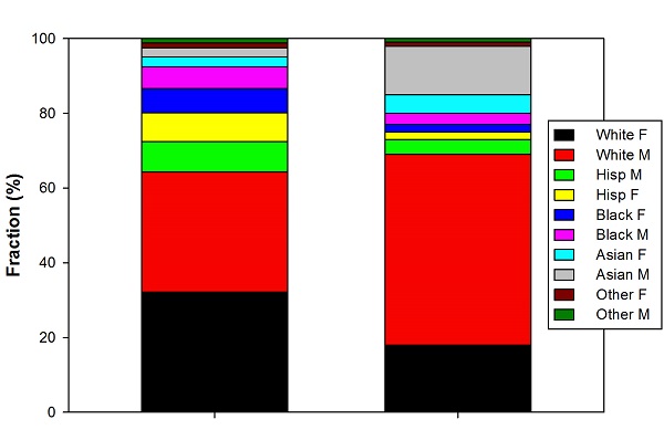
There was a article in Scientific American about diversity in STEM collecting together the best demographic data available about the science and engineering workforce. It’s a useful collection of references, and comes with some very pretty graphics, particularly this one, showing the demographic breakdown of the US population compared to the science and engineering fields:… Continue reading Bad Graphics, STEM Diversity Edition
Category: Data Presentation
Medium, Message, and Secondary Audiences in Public Speaking
Having just returned from a long trip where I gave three talks, one of the first things I saw when I started following social media closely again was this post on how to do better presentations. The advice is the usual stuff– more images, less text, don’t read your slides, and for God’s sake, rehearse… Continue reading Medium, Message, and Secondary Audiences in Public Speaking
Great Moments in Puzzling Axis Labels
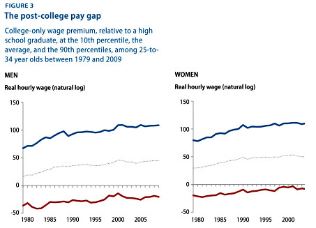
While I’m complaining about statisticulation in social media, I was puzzled by the graph in Kevin Drum’s recent post about college wage gaps, which is reproduced as the “featured image” above, and also copied below for those reading via RSS. I don’t dispute the general phenomenon this is describing– that the top 10% of college… Continue reading Great Moments in Puzzling Axis Labels
Against “Gen Eds”
Matt Reed, who will forever be “Dean Dad” to me, has a post on “new” topics that might be considered for “gen ed” requirements, that is, the core courses that all students are required to take. This spins off a question Rebecca Townsend asked (no link in original), “Should public speaking be a general education… Continue reading Against “Gen Eds”
The Visual Presentation of Misleading Information, Anti-Asian Bias Edition
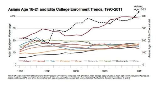
In which the skewing of a data plot in Ron Unz’s epic investigation of college admissions makes me more skeptical of his overall claim, thanks to the misleading tricks employed. ———— Steve Hsu has a new post on a favorite topic of his, bias against Asians in higher ed admissions. This is based on a… Continue reading The Visual Presentation of Misleading Information, Anti-Asian Bias Edition
How to Give a Good PowerPoint Lecture, 2012
My timekeeping course this term is a “Scholars Research Seminar,” which means it’s supposed to emphasize research and writing skills. Lots of these will include some sort of poster session at the end of the term, but I decided I preferred the idea of doing in-class oral presentations. Having assigned that, of course, I felt… Continue reading How to Give a Good PowerPoint Lecture, 2012
How to Present Scientific Data
In the same basic vein as last week’s How to Read a Scientific Paper, here’s a kind of online draft of the class I’m going to give Friday on the appropriate ways to present scientific data. “Present” here meaning the more general “display in some form, be it a talk, a poster, a paper, or… Continue reading How to Present Scientific Data
Of Education Bubbles and Bad Graphs
The new school year is upon us, so there’s been a lot of talk about academia and how it works recently. This has included a lot of talk about the cost of higher education, as has been the case more or less since I’ve been aware of the cost of higher education. A lot of… Continue reading Of Education Bubbles and Bad Graphs
Do You Really Need a Graph for That?
As long as I’m picking on education research papers in Science, I might as well call out the one immediately after the paper I wrote up in the previous post. This one, titled Graduate Students’ Teaching Experiences Improve Their Methodological Research Skills, is another paper whose basic premise I generally agree with– they found that… Continue reading Do You Really Need a Graph for That?
Great Moments in Deceptive Graphs
This morning, via Twitter, I ran across one of the most spectacular examples of deceptive data presentation that I’ve ever seen. The graph in question is reproduced in this blog post by Bryan Caplan, and comes from this econ paper about benefits of education. The plot looks like this: This is one panel clipped out… Continue reading Great Moments in Deceptive Graphs


