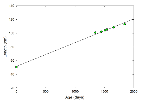
Early last year, we began marking SteelyKid’s height off on a door frame in the library. She occasionally demands a re-measurement, and Saturday was one of those days. Which made me notice that we now have a substantial number of heights recorded, and you know what that means: it’s time for a graph.
The “featured image” above shows the results, and I’ve stuck in a zero-day point using her length at birth. The solid line in the graph is a linear fit to the data, because nothing could possibly be wrong with that. According to the fit, we can project that she’ll reach a height of 3.0 meters a few months before her twentieth birthday, and since the R2 value is 0.99, you know that’s solid science.
Her current height, for the record, I rounded up to 44.5 inches. And if you want to see just how big she’s gotten, here’s a photo from an after-dinner trip to the playground at what will be her school in just a couple of weeks, when she starts kindergarten. Yikes.

I got The Pip to stand by the door frame on Saturday as well, and his official height was 33 inches. As it’s a single data point, though, it’s not worth graphing– you’ll have to wait until we accumulate more data before we can compare the two in a truly scientific manner…

Now do an analysis of your grocery bills. *chuckle*
Interestingly the curve is indeed pretty much linear for quite some time before it stagnates, but I don’t think the length at birth should be on the linear trend. They grow faster in the first months, see eg http://happybabyusa.files.wordpress.com/2011/05/growth-chart.jpg
Scientific parenting, indeed 🙂 If you were doing the regular post-natal checkups, you should have a whole bunch of data points up to around day 400 or so, and you’ll see that the actual curve down there is roughly logarithmic.
When my daughter was born, I started recording height, weight, and head size in Excel. I also found the raw data from both the CDC and WHO which are used to generate the height-weight curves.
Bee, I don’t think this is inconsistent with that burst phase effect. It looks like if you remove the t=0 point and refit the SteelyKid data, you’ll get an intercept of 65-ish rather than 50. From the linked chart, burst phase accounts for ca. 10 cm. of height difference.
What we can conclude from this, though, is that Chad is a terrible parent. 😉 Either for malnourishing his kid during a crucial growth phase, or by being negligent enough to skip recording crucial height data during the early period of this experiment. – He really needs to make it up to SteelyKid. Buy her a pony or something. It’s safer not to have a 2+ meter tall teen upset at you.
I do have higher-frequency data covering the gap in this graph, from her regular doctor appointments during that span. Those are recorded via a different technique in another data repository, though, and as such I’m saving them for a separate publication.